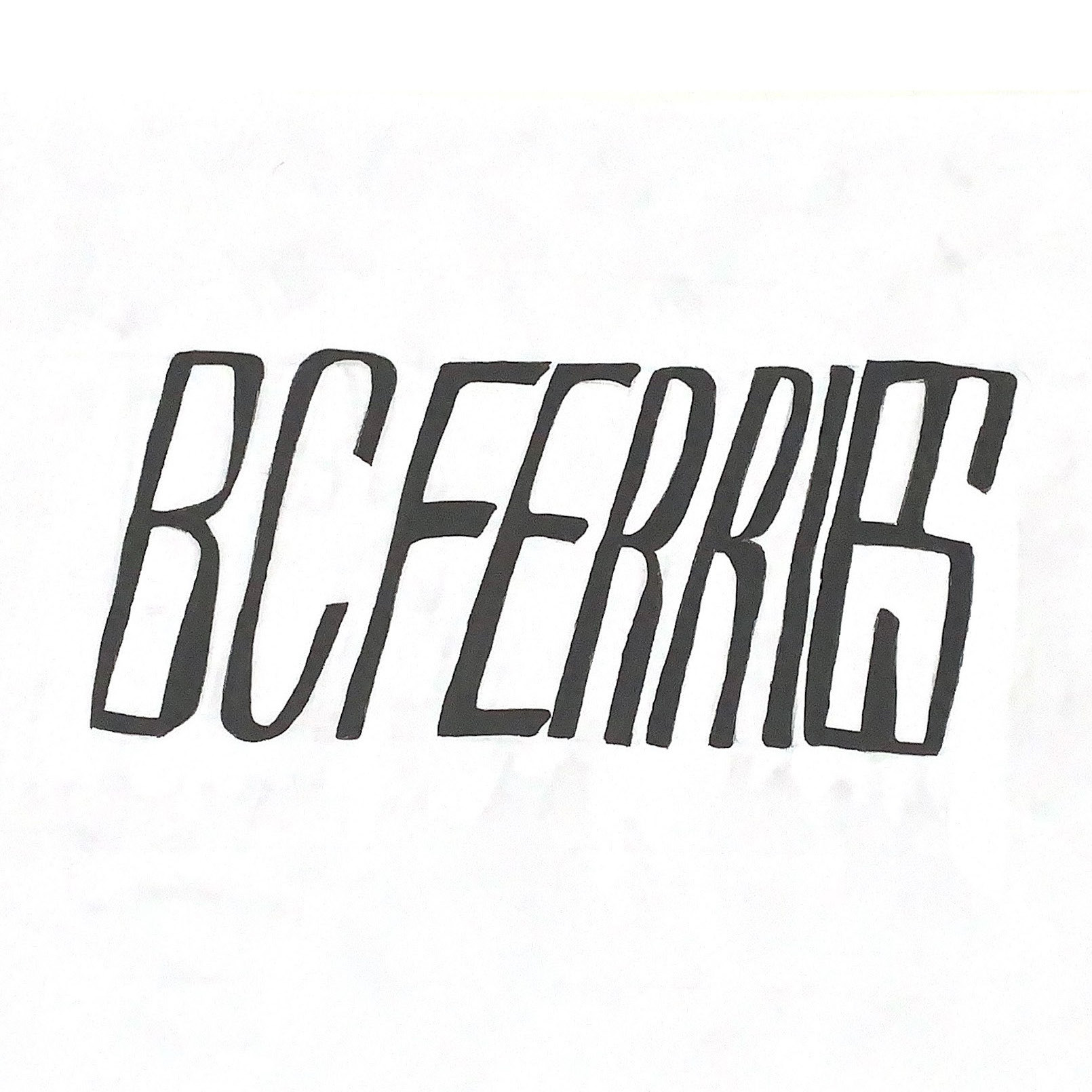
BCFerries
BRAND IDENTITY
Refreshing the BCFerries brand positioning and visual identity
PROJECT SUMMARY
Since 1960, BCFerries has been a leader in public ocean transportation by providing safe travel routes for all citizens of British Columbia. However, BCFerries has been failing to connect to its key target audience who most frequently use the ferry service. They perceive BCFerries as a company who prioritizes tourism over public service. Customer satisfaction rate has been steadily decreasing for the past five years.
BCFerries must undergo a visual transformation to reinforce their brand values and their mission statement across their customer touch-points. This fictional brand identity and positioning refresh will better promote BCFerries as an essential public service and a community ambassador to its target audience.
Not only will this brand identity better reflect the company BCFerries is today , but it will usher in a new era of change for them as they work to become a leader in a more sustainable future.
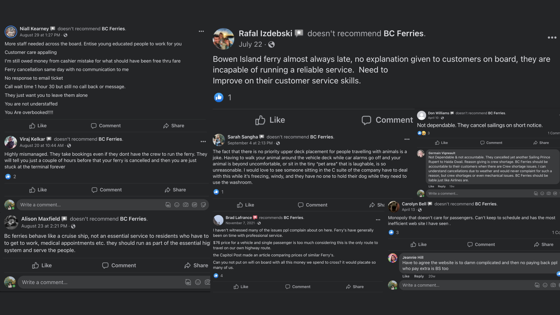
BCFerries' Facebook Review Page Testimonials
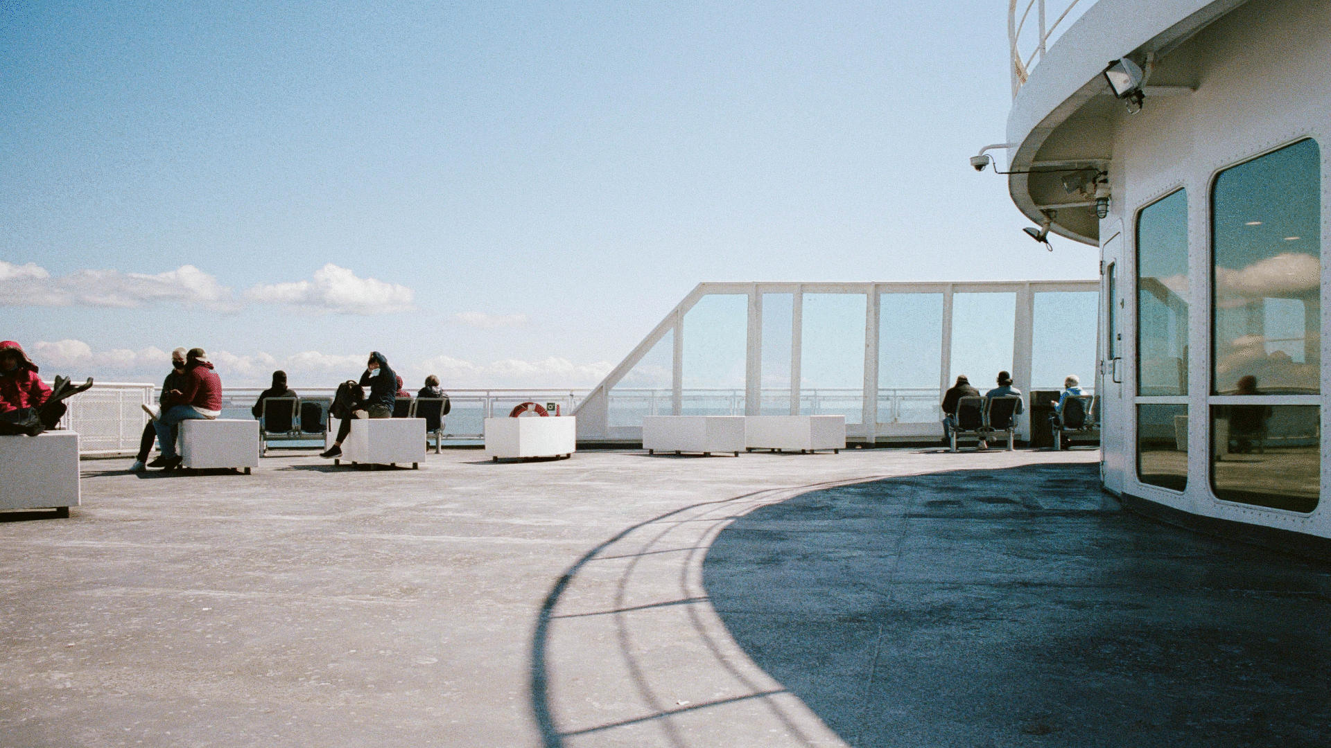
TARGET AUDIENCE Local Island Residents
• Gen-X
• Working-Class
• Born on Vancouver Island
• Experienced with the BCFerry system
• Boards the ferry every week for work and/or medical appointments
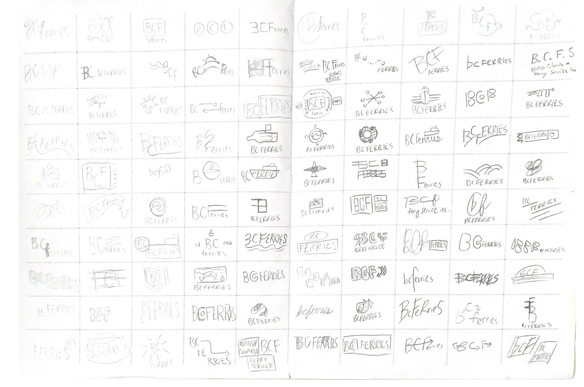
LOGO Process
For two weeks, I worked on developing three directions which either that embodied one or more of the important characteristics of the brand:
1. Community-Centred
2. Experienced Focused
3. Historically Significant
4. Socially Responsible
5. Climate & Impact Conscious
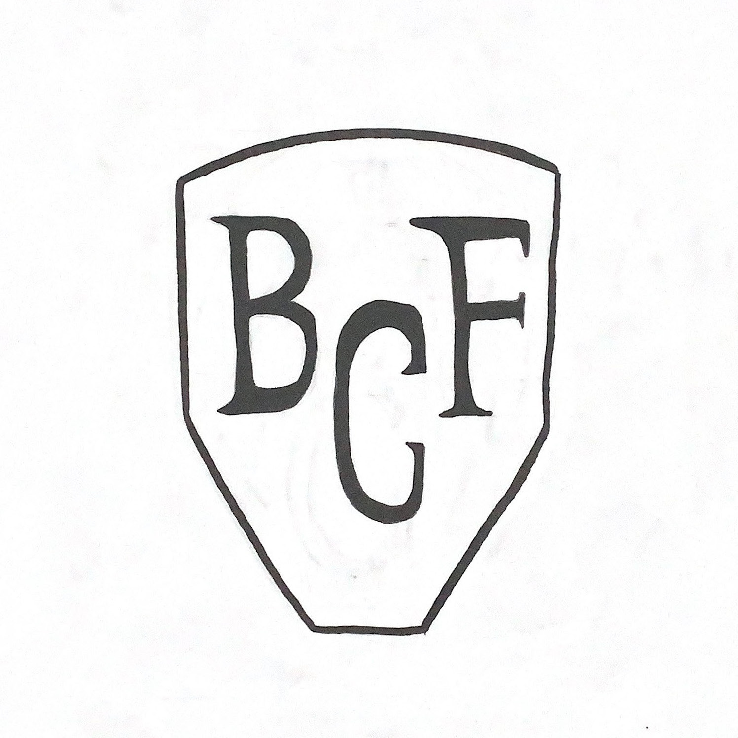
The first direction (left) is inspired by Heraldic Shields which pay homage to the history of British Columbia. I found this direction fitting for BCFerries to better showcase its history in the province and its importance to its citizens. Furthermore, I thought the shield is reminiscent of what a ferry looks like when you see it straight-on. Meanwhile, the second direction (middle) is a simple and utilitarian approach. It is a logo direction focused on indicating motion or speed through the custom italics.
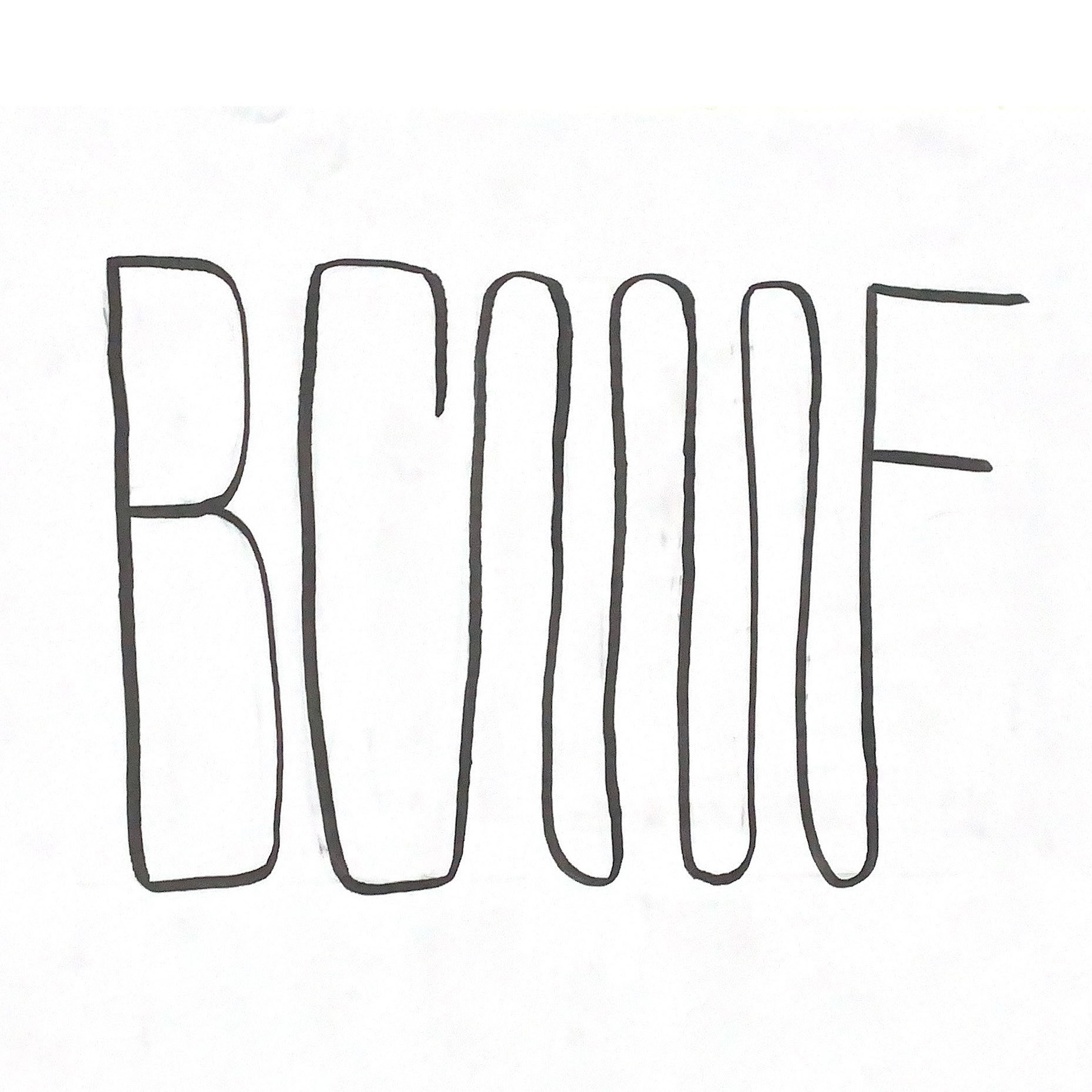
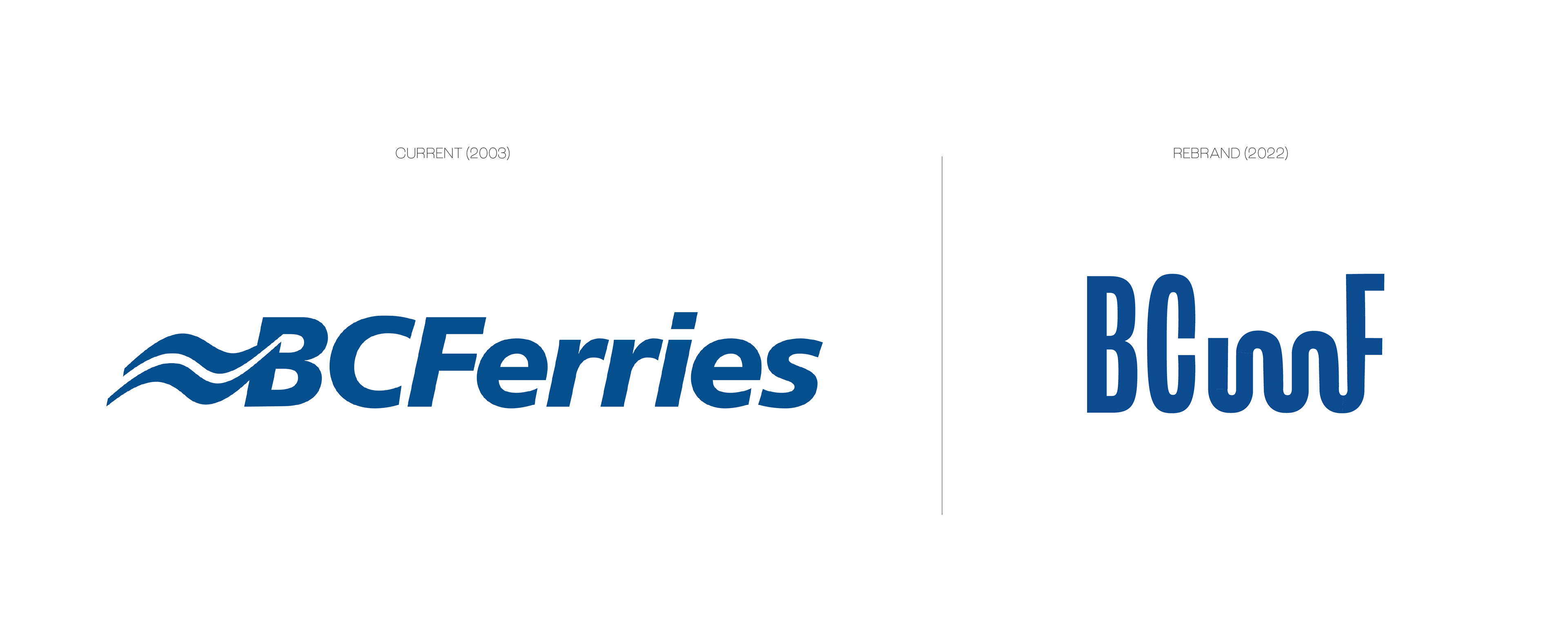
The third direction (right) is a logo which integrates the current elements into a typographic word mark. The proposed logo conveys the fluid nature of water and the metaphorical "winding highway" that the ferry navigates on a day-to-day basis. This is the direction I chose to pursue for this project. Its sleek boldness and abstract nature best conveys the proposed brand repositioning as a vehicle for the West Coast travel route.
Not only will this brand identity better reflect the company BCFerries is today, but it will usher in a new era of change for them as they work to become a leader in a more sustainable future.
LOGO Challenges
Of course, the mark was not perfect. The logo was the foundation of the BCFerries' rebrand; it would become a system effecting brand assets and user experience. Although I was satisfied with the concept, there were many technical problems with the logo that I had to conquer first while transitioning from traditional to digital.
Not Really Feeling a Connection
Unfortunately, the C and F being connected by the stroke did not translate well into the digital space. The C became illegible and it could be read as BOF from afar. The ligature had to go.
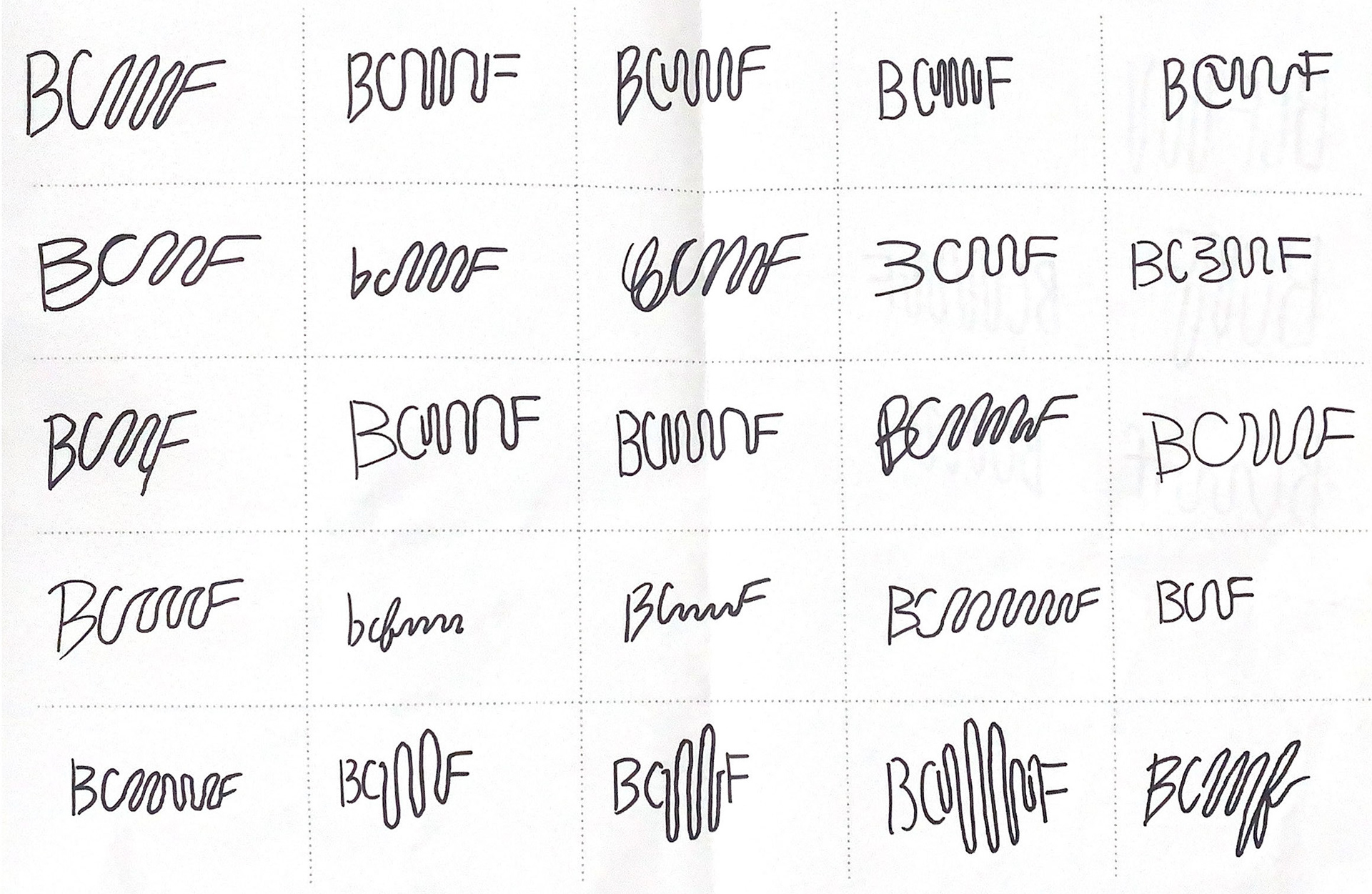
Introducing: BCMF
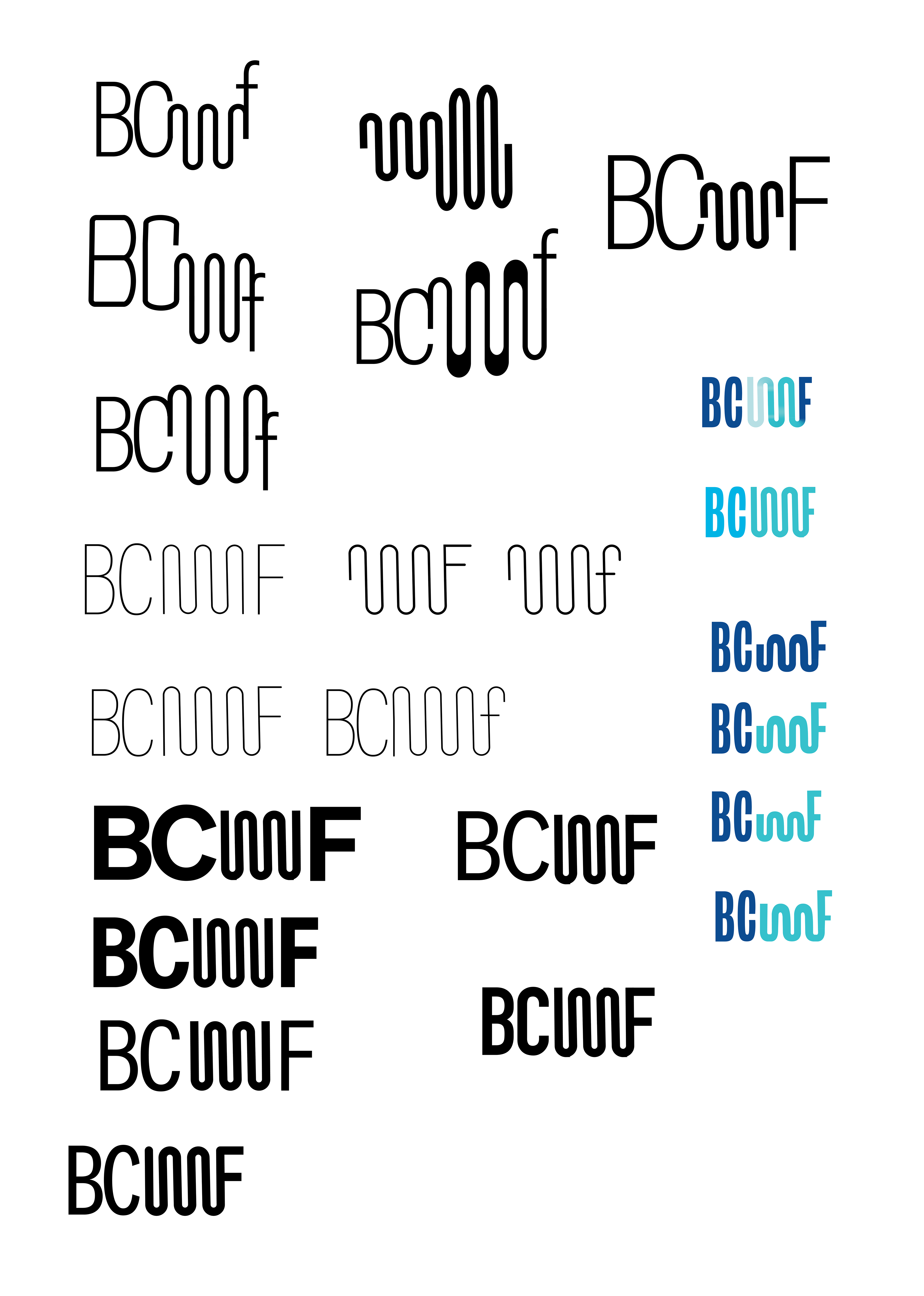
The abstract curve proved to serve a different legibility problem. Several people would read it as BCMF or BCIMF. I experimented with colour to solve this problem, but what proved most effective was changing the x-height of the wave. With the all-caps, the lowered x-height of the wave was enough to differentiate it from the letters and be its own abstract form. Although it is a slight change, the wave was also changed to match the curve of the "C" for cohesion.
You get a logo! And you get a logo!
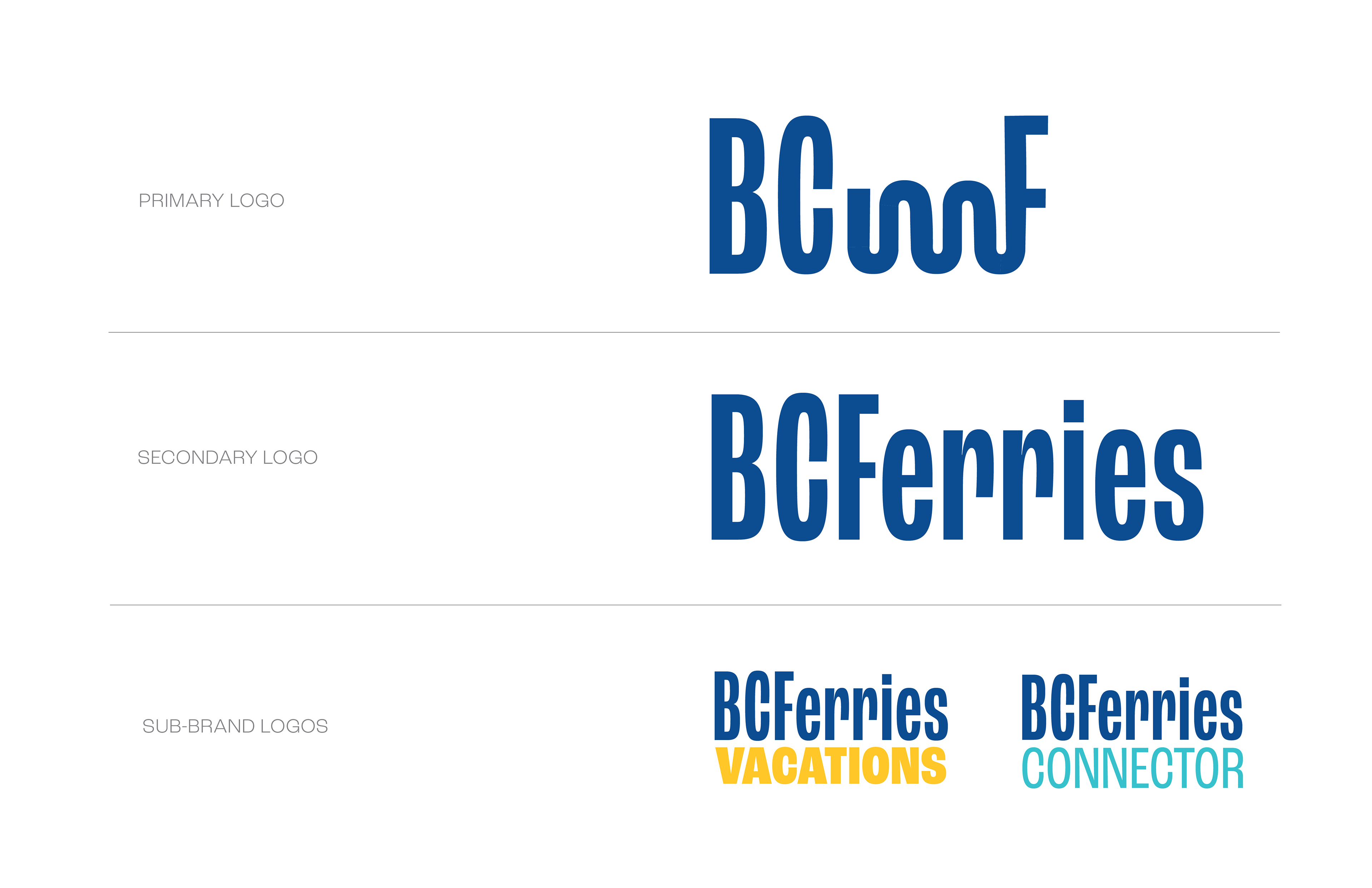
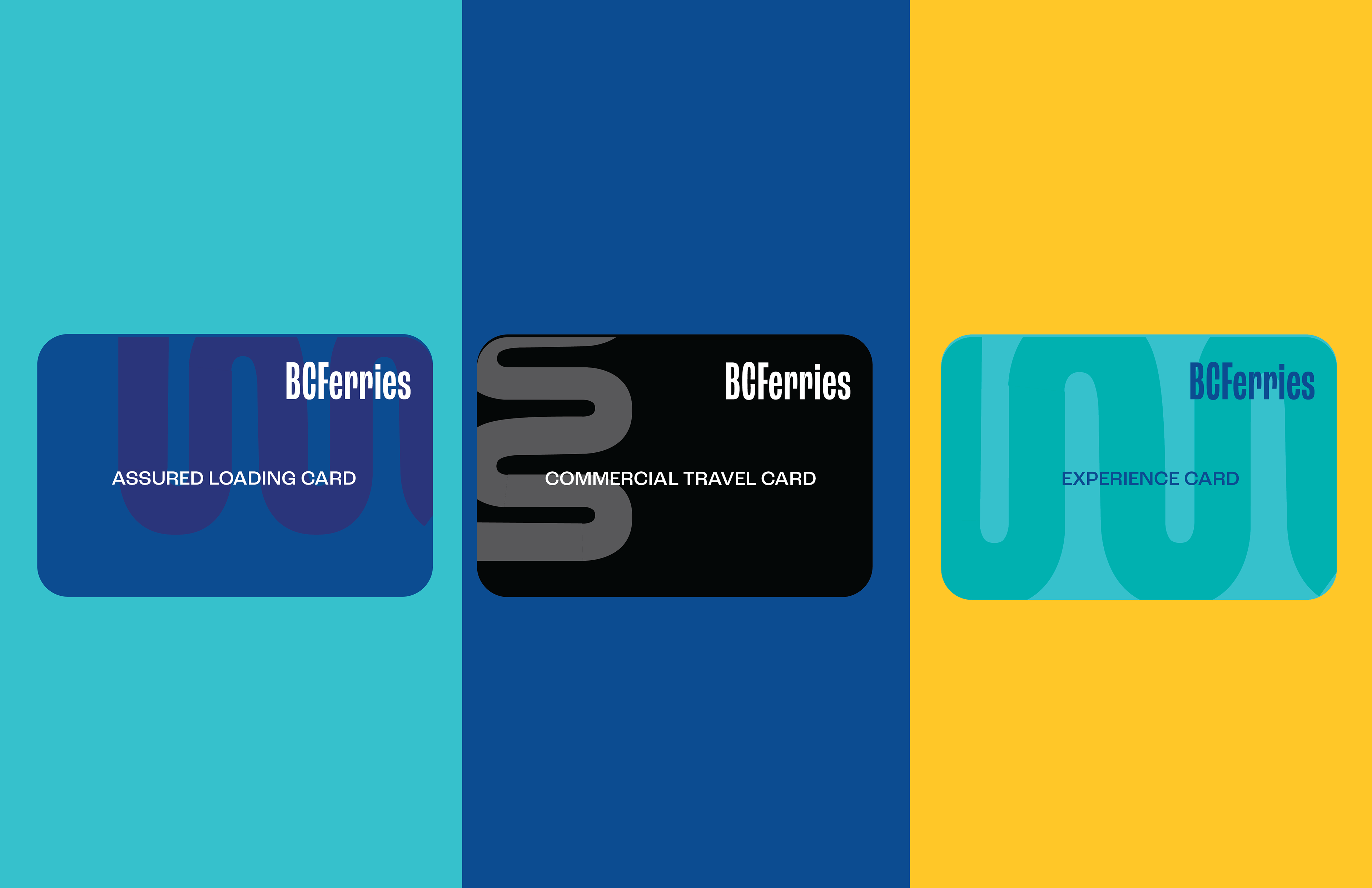
With this project's conceptual rebrand, it felt important to address the different situations which BCFerries exists as a brand. The current logo only uses the initials of BCFerries; its an abstract mark which can be confusing to newcomers and out-of-context situations.
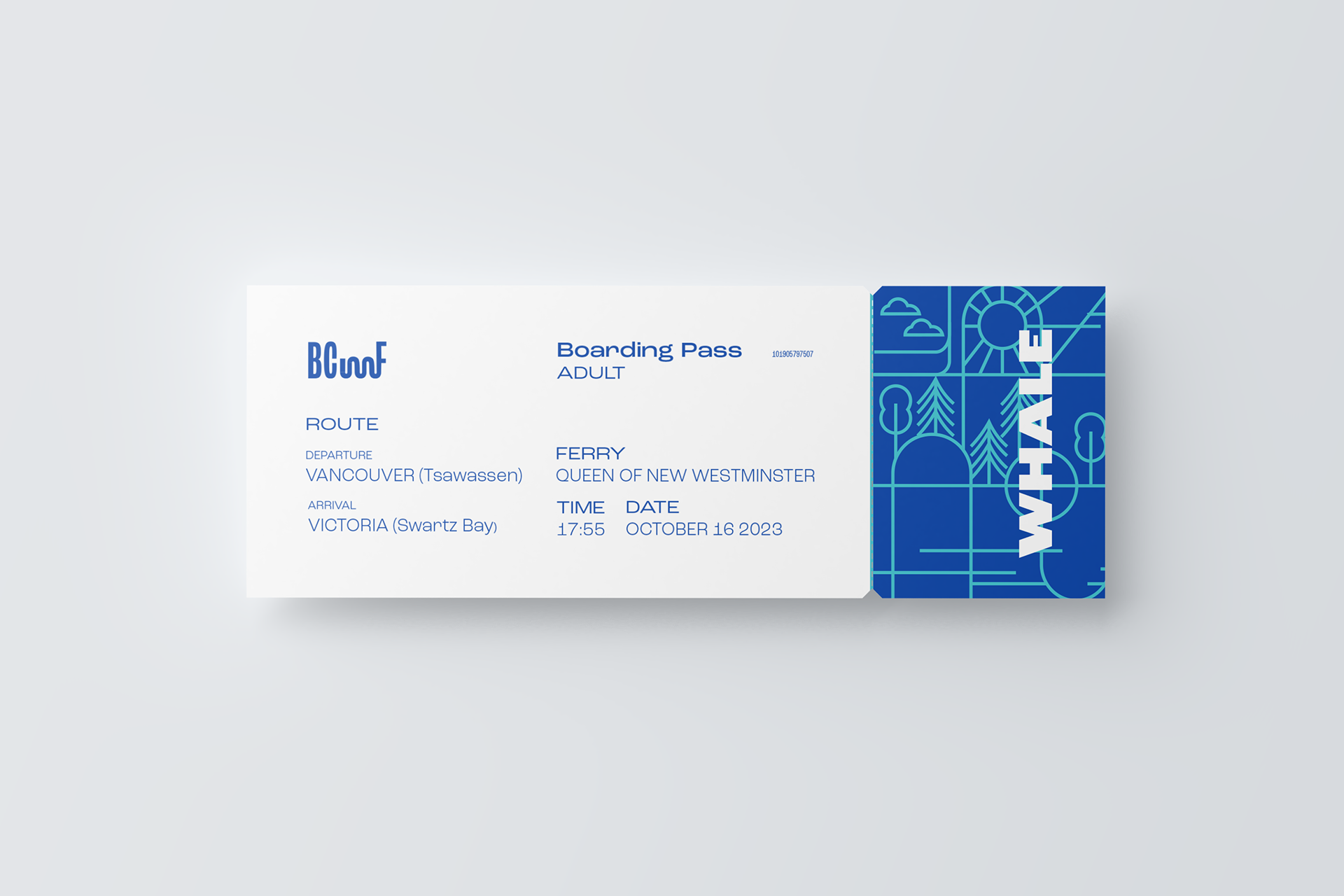
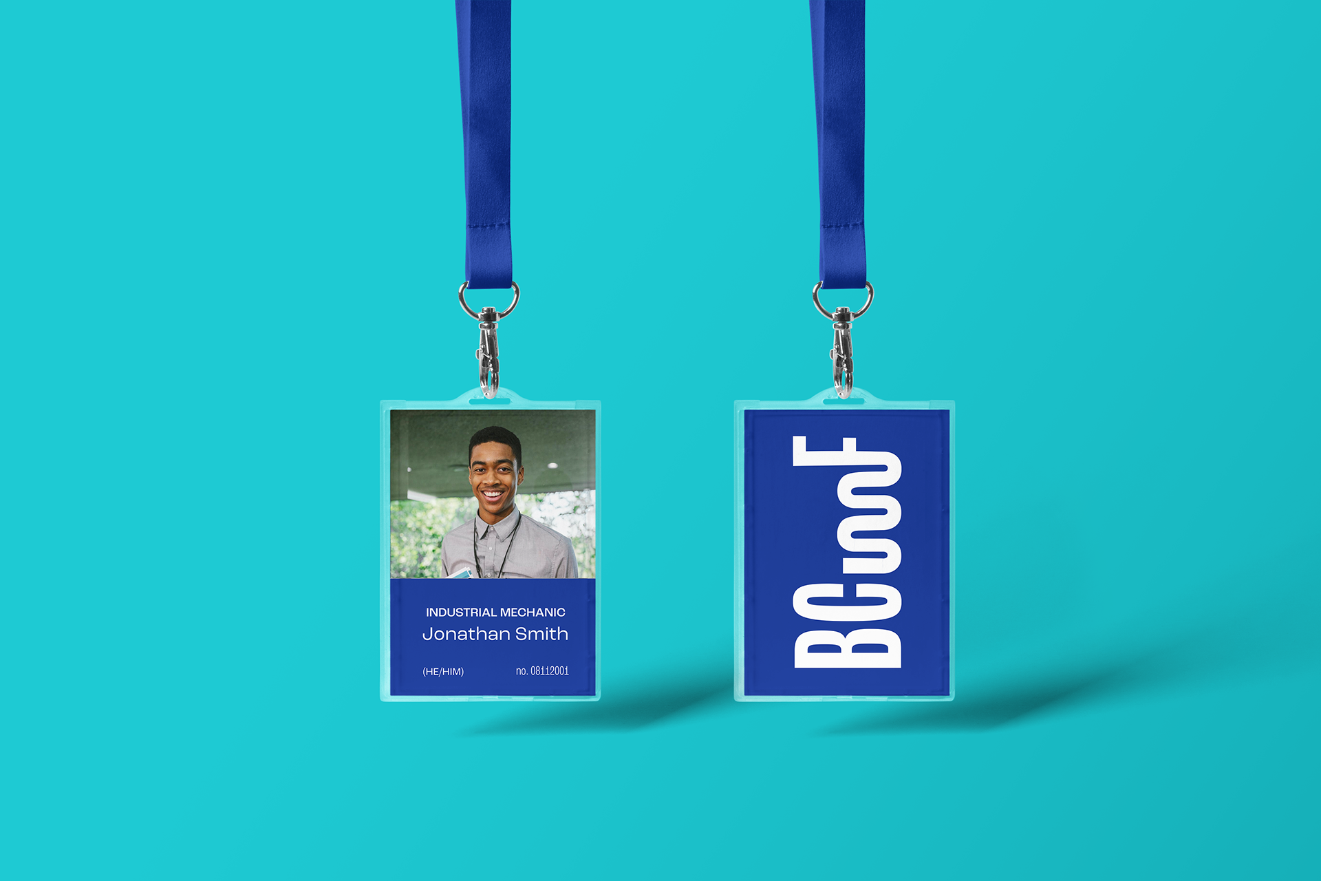
To solve this problem, I developed a secondary logo which serves as a more traditional corporate word mark. The purpose of this secondary logo is to be used for print and marketing. Furthermore, it creates opportunity for BCFerries to build sub-brands that can exist within one cohesive family.
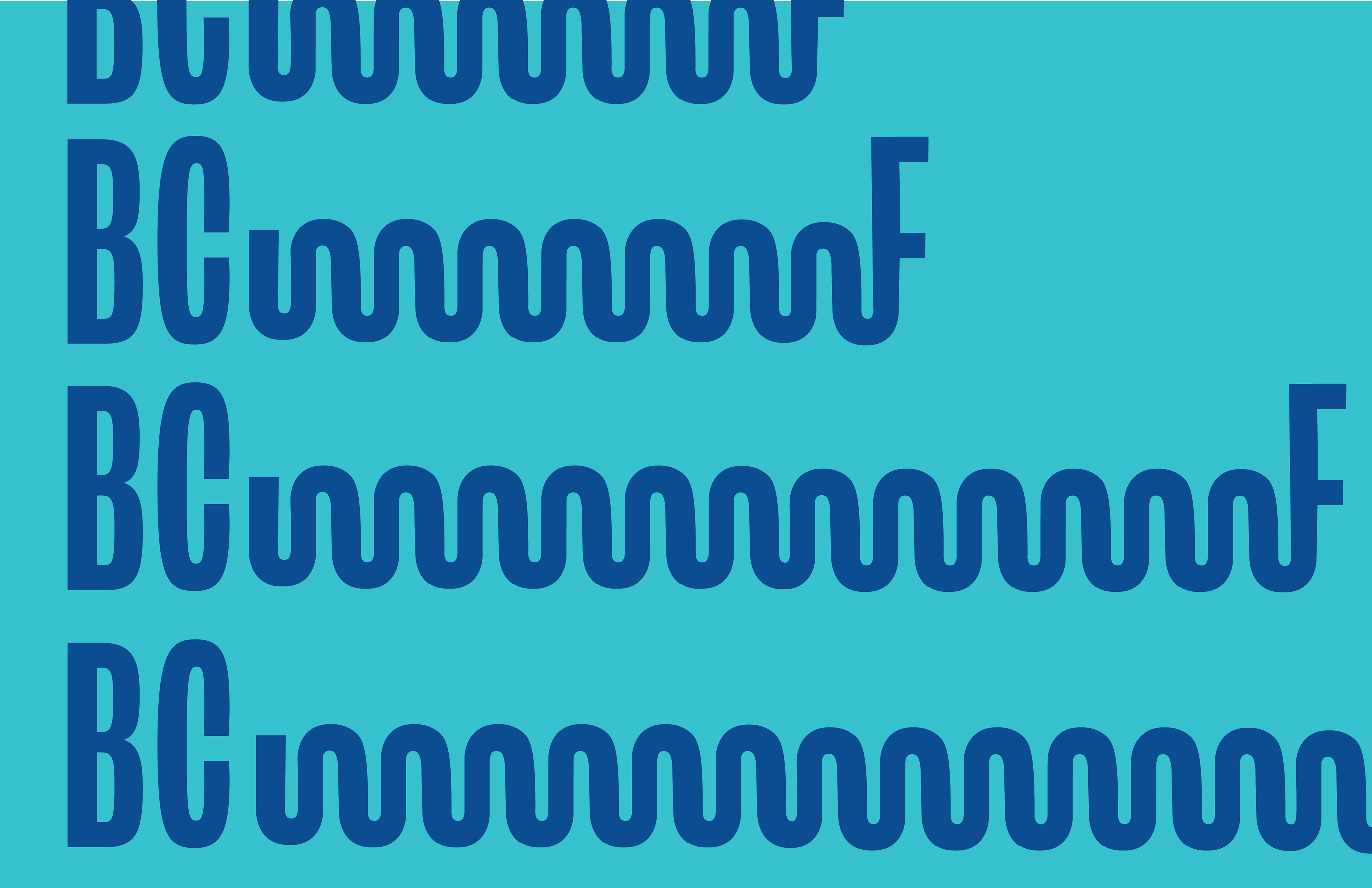
Just like the fluid nature of water and staying true to the idea of "movement", the primary logo has additional variations which lengthen the mark to absurd proportions. Not to be used in corporate or print, these variations bring a sense of joy to the brand which was absent before.


VISUAL IDENTITY Art Direction
The main challenge of this project was to establish a visual aesthetic which conveyed and balanced two main aspects: the sleekness of a competent public transportation service and the joy of a ferry service dedicated to its journey. Without the sleek minimalism, BCFerries' brand is conveyed as a tourist joyride, which can be perceived as tone-deaf to its main audience who live on the West Coast. However, without the joy, BCFerries loses empathy and credibility as a public ambassador and socially responsible figure.
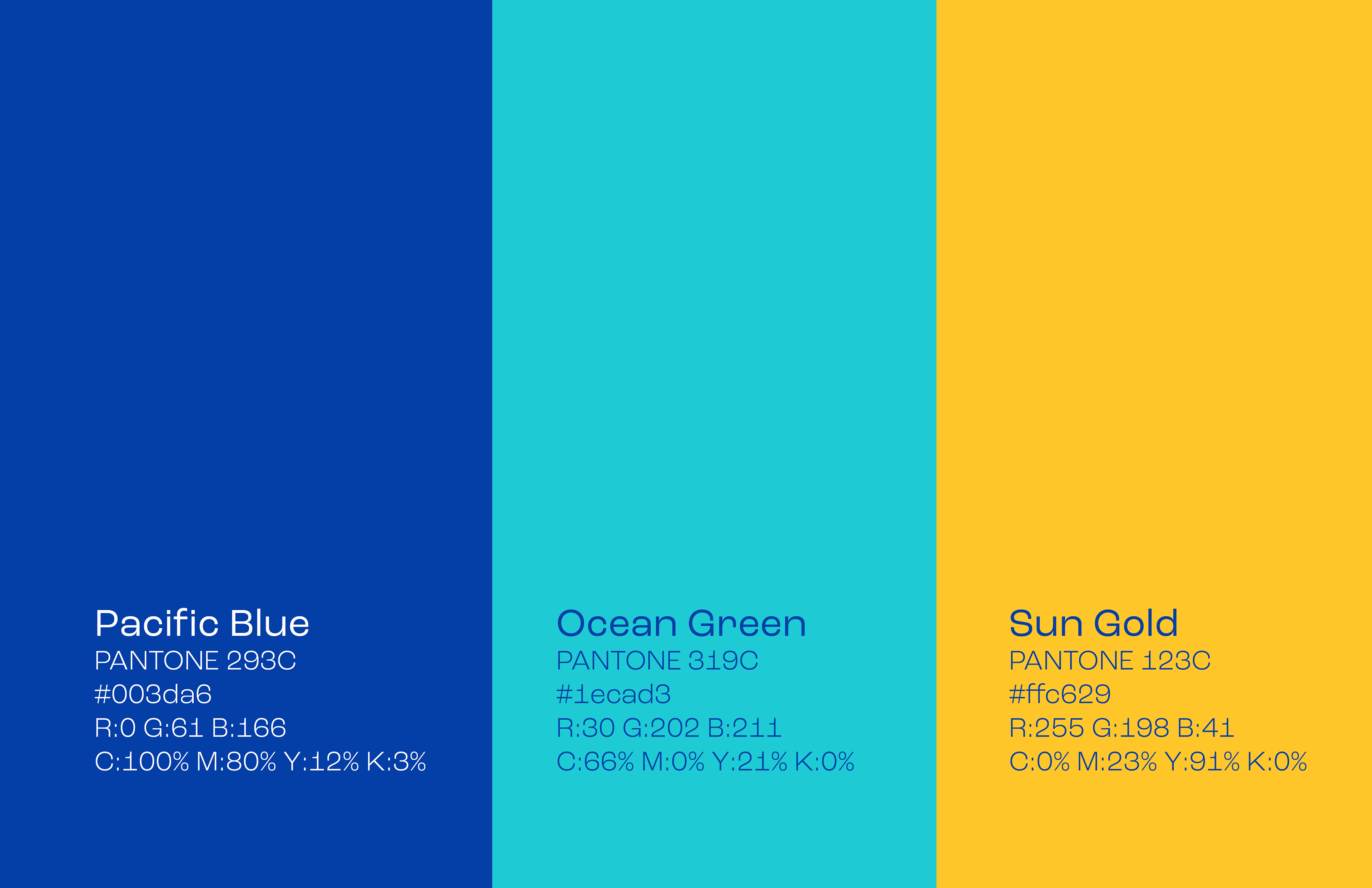
BCFerries' iconic blue is now saturated and richer, as if with a fresh coat of paint. A secondary teal is used to add depth and levity to the brand. The yellow is established for the sub-brand, BCFerries Vacations, to help differentiate between advertising and messaging.
The typeface used for the project is Roc Grotesk family. This is a huge family with 9 weights and 5 widths for a total of 45 fonts. This typeface allows for a sense of flexibility in the brand which can help BCFerries from becoming stale and predictable.
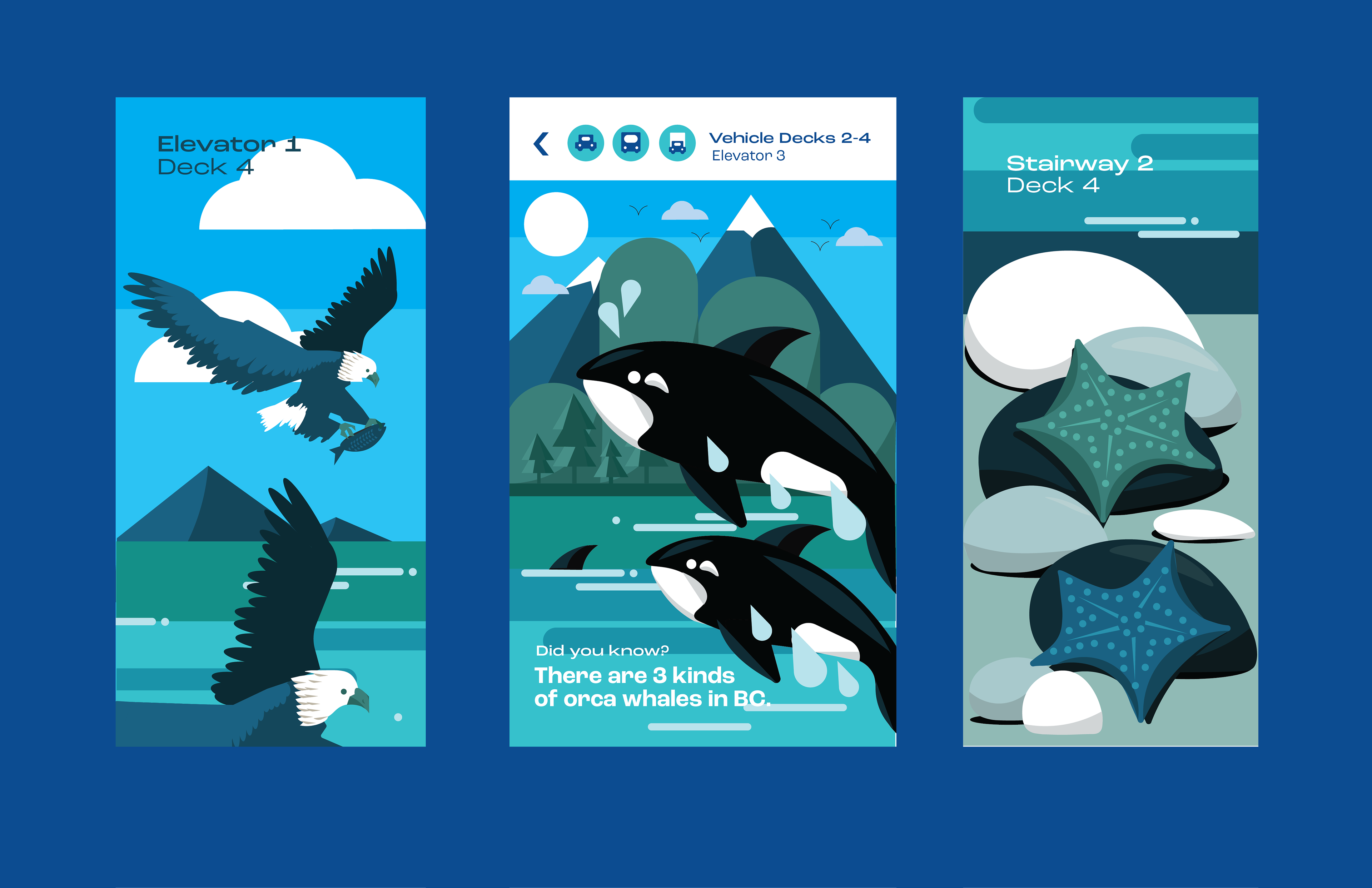
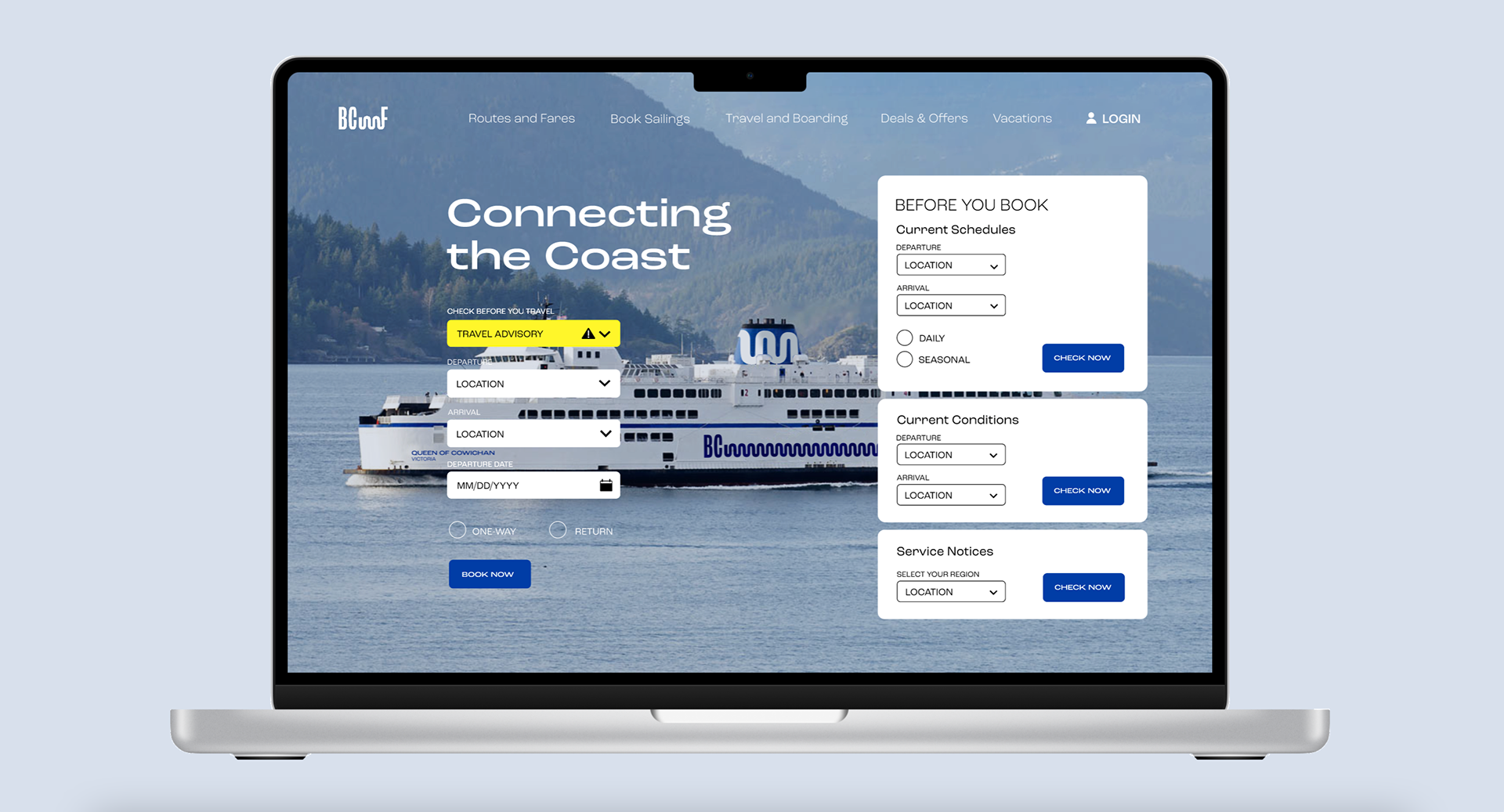
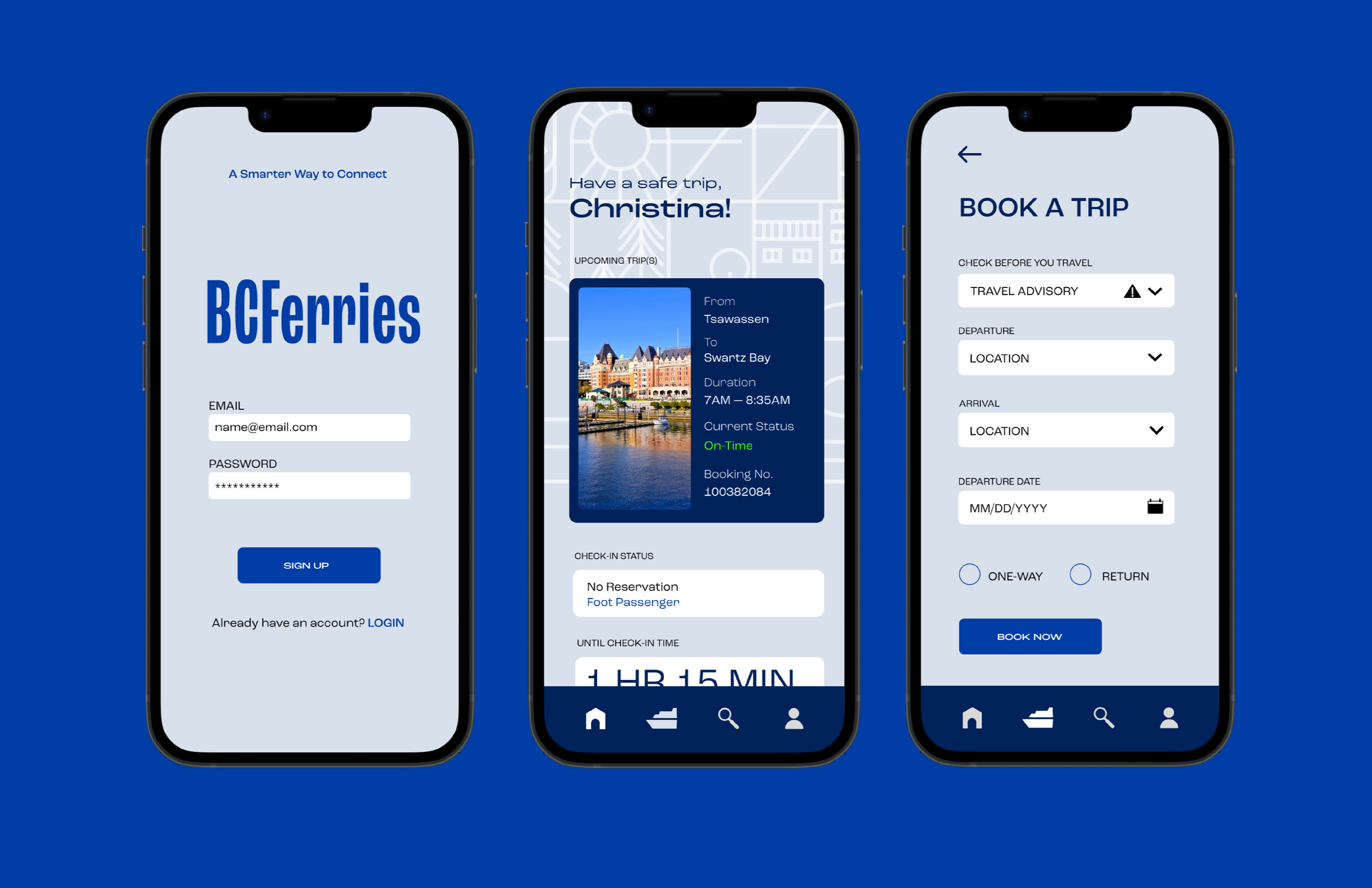
BRAND ASSETS User Experience
In the testimonials, a frequent complaint was the outdated user interface of the BCFerries website. Furthermore, there was a lot of frustration with the lack of communication, regarding cancellations, late notices, and lack of quality customer service. A new intuitive website interface and mobile communication is key for improving the reputation of BCFerries among its target audience.
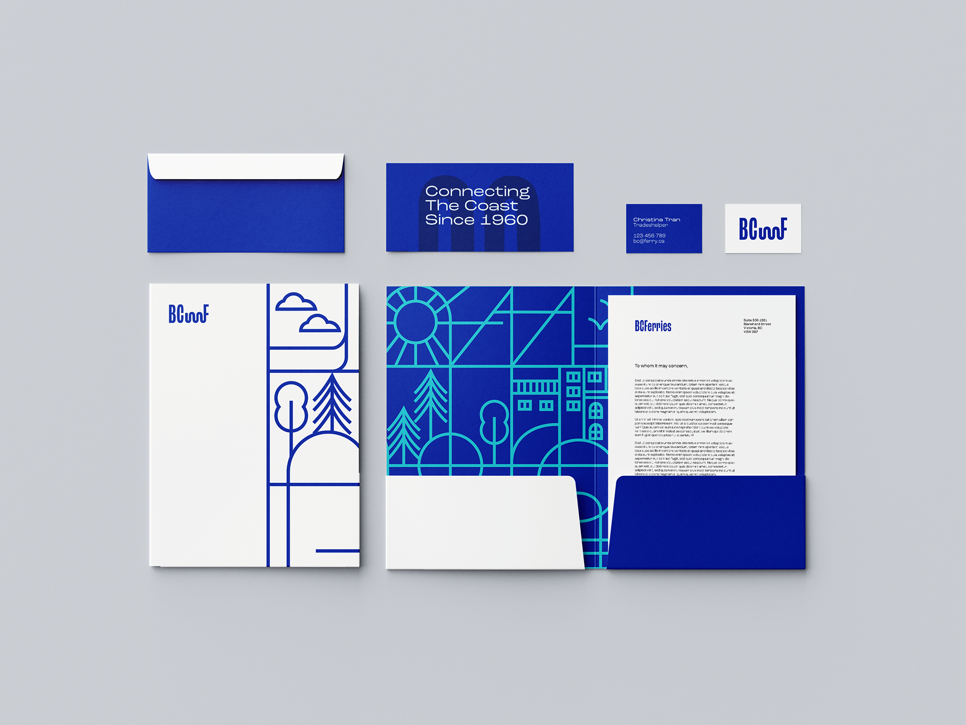
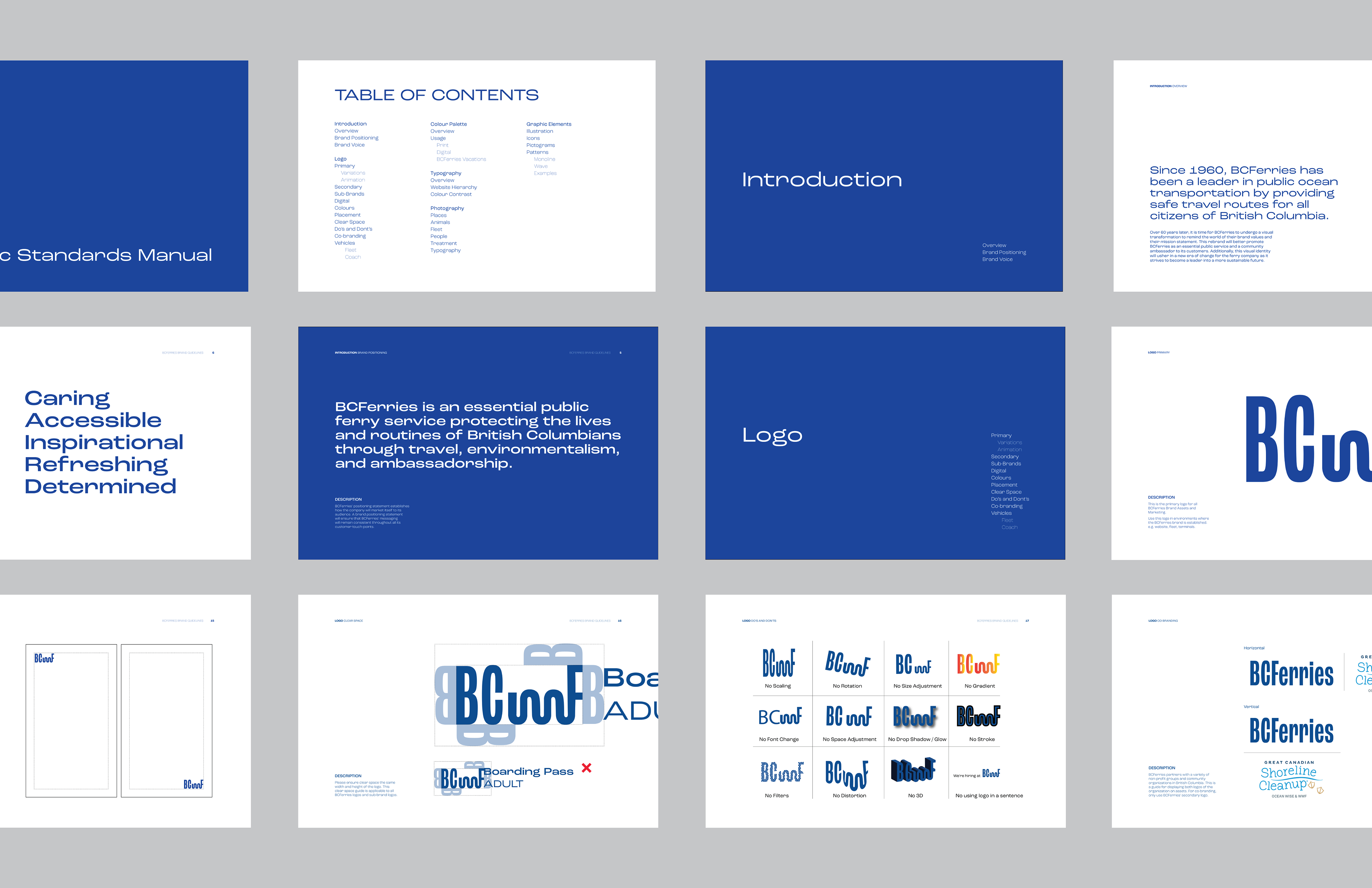
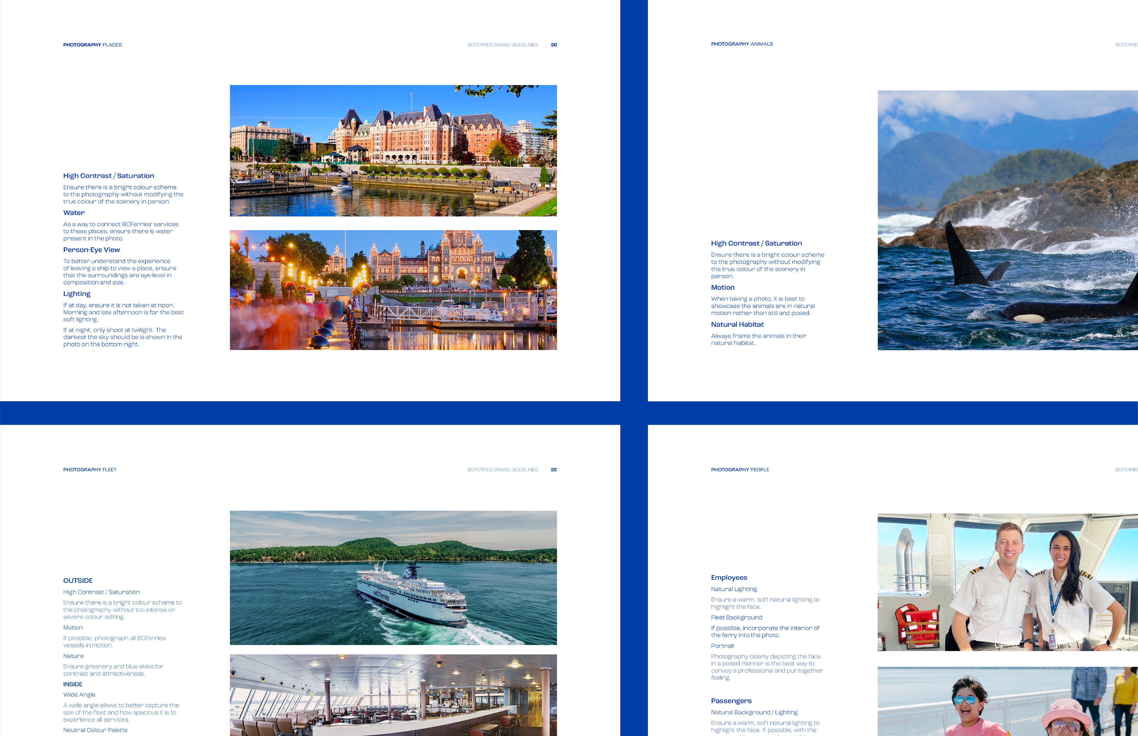
VISUAL IDENTITY Graphic Standards Manual
With over 40 pages, this extensive Graphic Standards Manual outlines not only showcases how to use the logo, but it explains further in depth how photography, brand voice, and brand elements should be utilized.

Thank you for reading.
Like what you see? Let's chat.